
The house hunt is slowly starting up again. I’ve gone back to my big schools spreadsheet with two key improvements – adding Croydon as an additional borough, because a friend pointed out that there are fast trains to London Bridge from there, and adding two more years of data, because another friend pointed out that there is sometimes wild variation in the results from year to year.
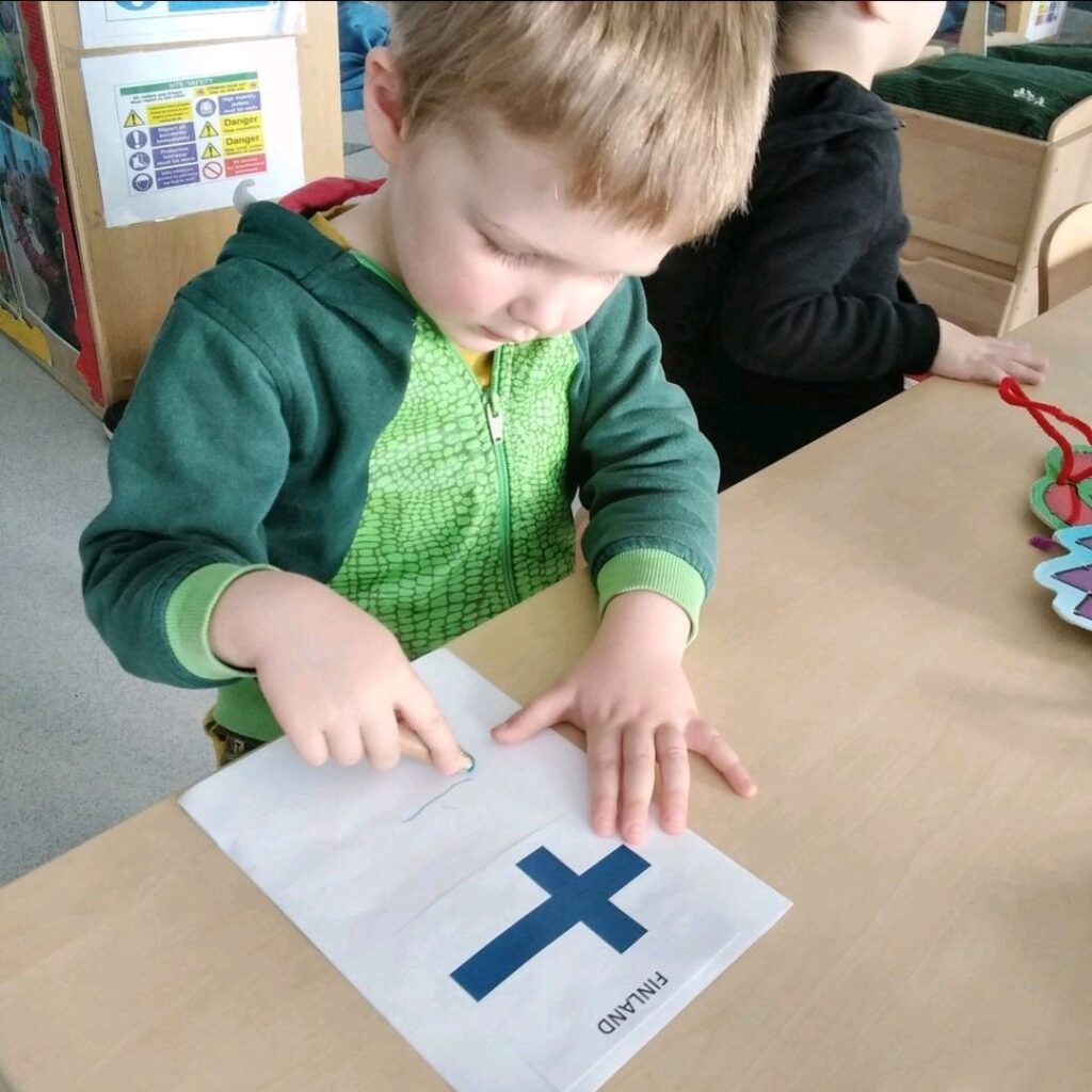
I’ve also become Woolwich-curious. I have lived close to the Thames since 2012 – Pimlico, Bermondsey, Rotherhithe – and I would feel a poetic sense of continuation if we lived in Greenwich or Woolwich next. Maybe we will eventually end up in Finland if I keep inching us eastwards every time we move.
However, adding the two extra years adds a layer of complexity to my analysis. I’m currently thinking that the approach should be that the base assumption for a school should be it’s latest results but marks can be deducted for inconsistency across the three years, but I’m not sure.
For now I’ve started with some statistics. Five boroughs and three years gives me about 2,700 individual average scaled scores (this is the number representing the average score students received in one of the three subjects, scaled each year to account for more and less difficult exams). 100 is the minimum score students should be able to reach.
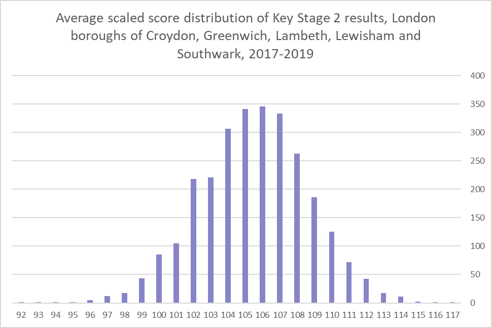
We are not looking for the best of the best, but I needed to know what constitutes a ‘good’ school in this dataset. I found that the 50th percentile for scores is around 106 points – so anything above 106 means a result is ‘above average’. That feels about the right cut-off point for us, so next I will be bucketing the schools based on those percentiles and seeing if that changes the results from my previous analysis. Fun!
Be First to Comment