
I’ve expanded my set of schools to two other boroughs and devised a methodology to tease out the exam performance data that matters to the parent of a non-disadvantaged (NON-DA) boy. I wanted to be able to rank or group all the schools notionally available to us by the test performance, but not just the overall average, but the score that is representative of pupils like my son.
Unfortunately you can’t break down the data by combined characteristics (NON-DA and boy), just one characteristic at a time (all boys, dis-advantaged as well as non-; or all disadvantaged pupils, whether boys or girls). And there were non-trivial differences in this regard as explained previously. To find out whether I should judge a particular school by the performance numbers for boys or the numbers for the NON-DA, I calculated whether social class or sex mattered more for each school and each subject.
For example, these are the scores for Maths at three schools in the set:
| School | Boys’ avg | Girls’ avg | Differential | DA avg | NON-DA avg | Differential | Performance predictor |
| School A | 96 | 97 | 1 | 93 | 104 | 7 | Social class |
| School B | 102 | 111 | 9 | 105 | 108 | 3 | Sex |
| School C | 101 | 105 | 4 | 101 | 105 | 4 | Neither |
For the schools where your social class seemed to make the most difference, I picked the NON-DA score for that school. If it was sex that mattered, I picked the boys’ score, and if there was no difference I picked the overall average.
This means that I ended up with three scores for each school, and it might be that in Reading the score was, say, 106, which is the average score for boys at that school; 104 for Grammar, Spelling and Punctuation which is the average NON-DA score; and 105 for Maths which is the average score across all pupils, because in Maths, neither sex nor social class were particularly predictive of performance. They have such an excellent Maths teacher that he or she is able to get absolutely everyone to learn.
Then I created four groups of schools based on the resulting sets of scores – A, B, C and D in descending order of exam performance. I made the A and D groups fairly exclusive. Just the tippy top and at the other end those that could not get students to the minimum level in at least one subject. The Bs and Cs are broader churches.
Given that this whole project is in aid of trying to see where we should live given the schools there, I plotted them on the map with colour-coding to show the groups.
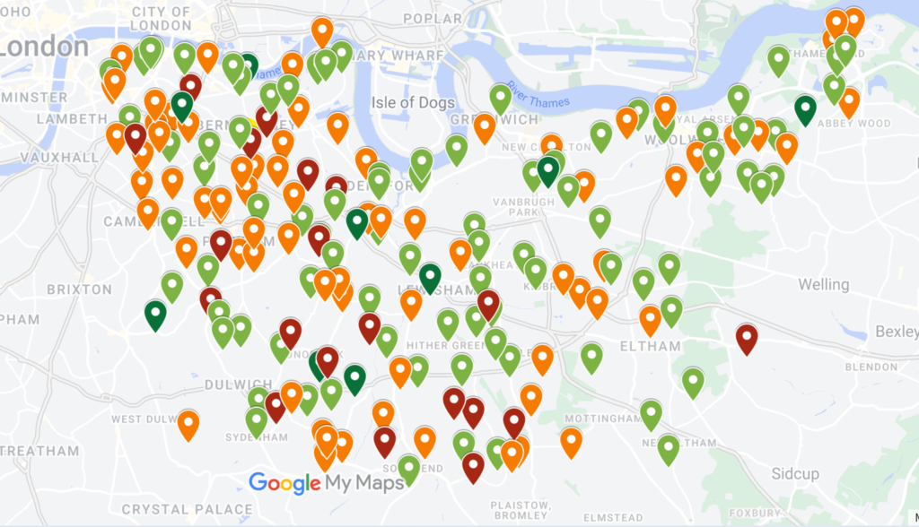
Now we’re getting somewhere. Next step: identify ‘hotspots’ of as many good schools together as possible.
[…] cool 32% rent increase. ‘Agreed’ is perhaps a strong word. It’s a good thing the schools research is yielding some insights as it makes me feel like we have a bit of agency to change our […]